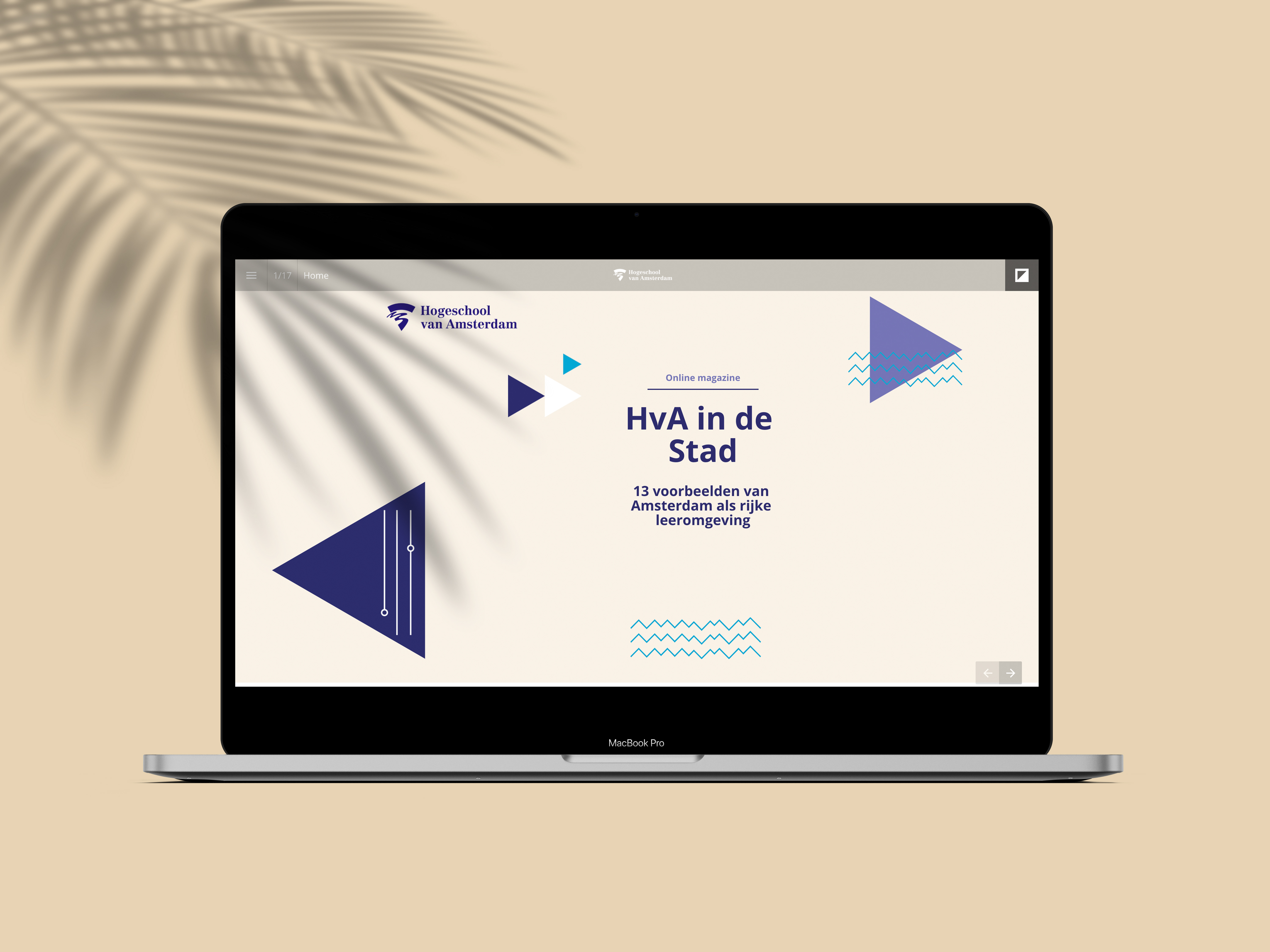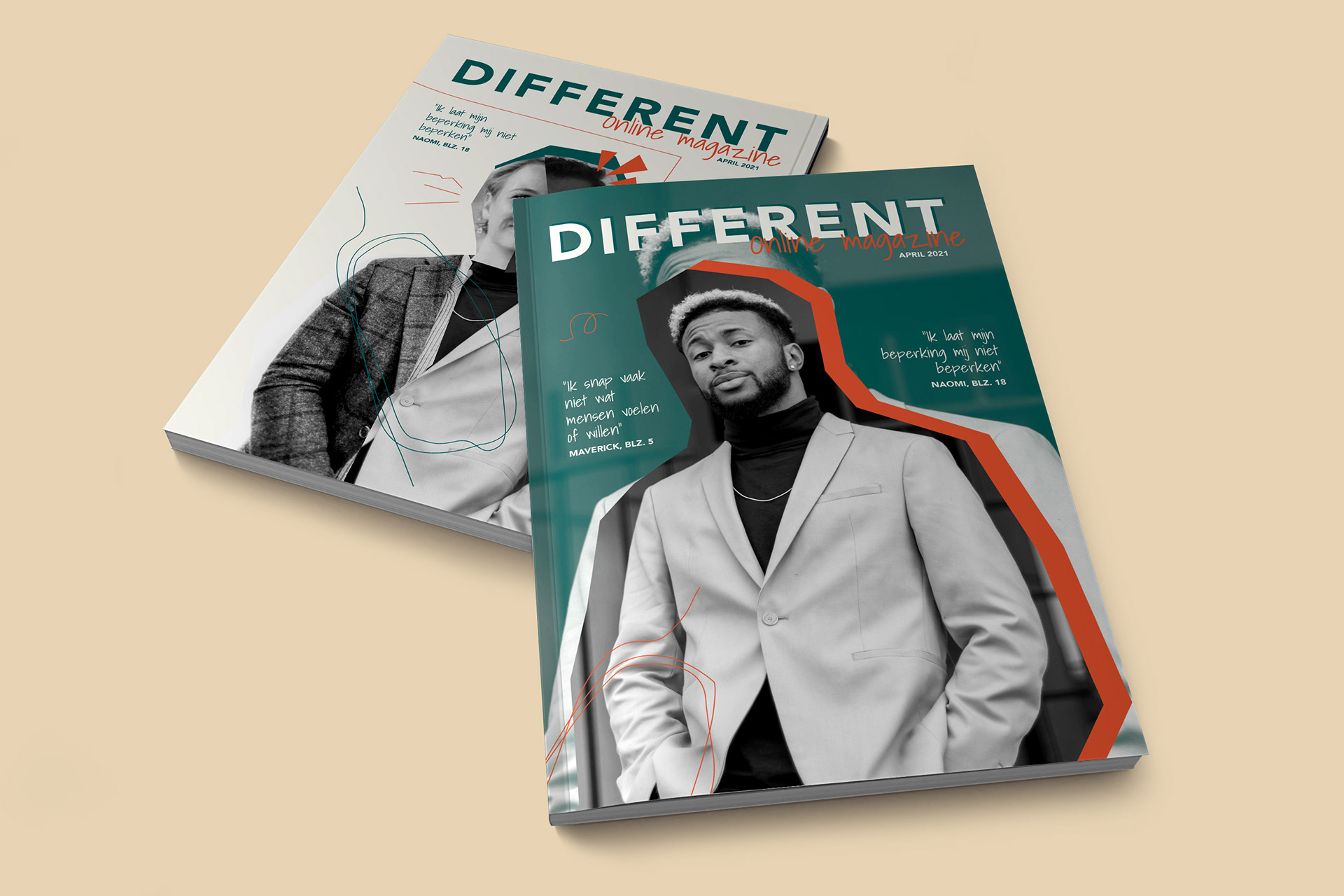
Different
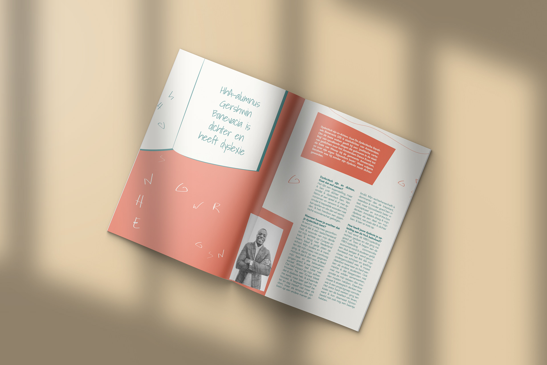
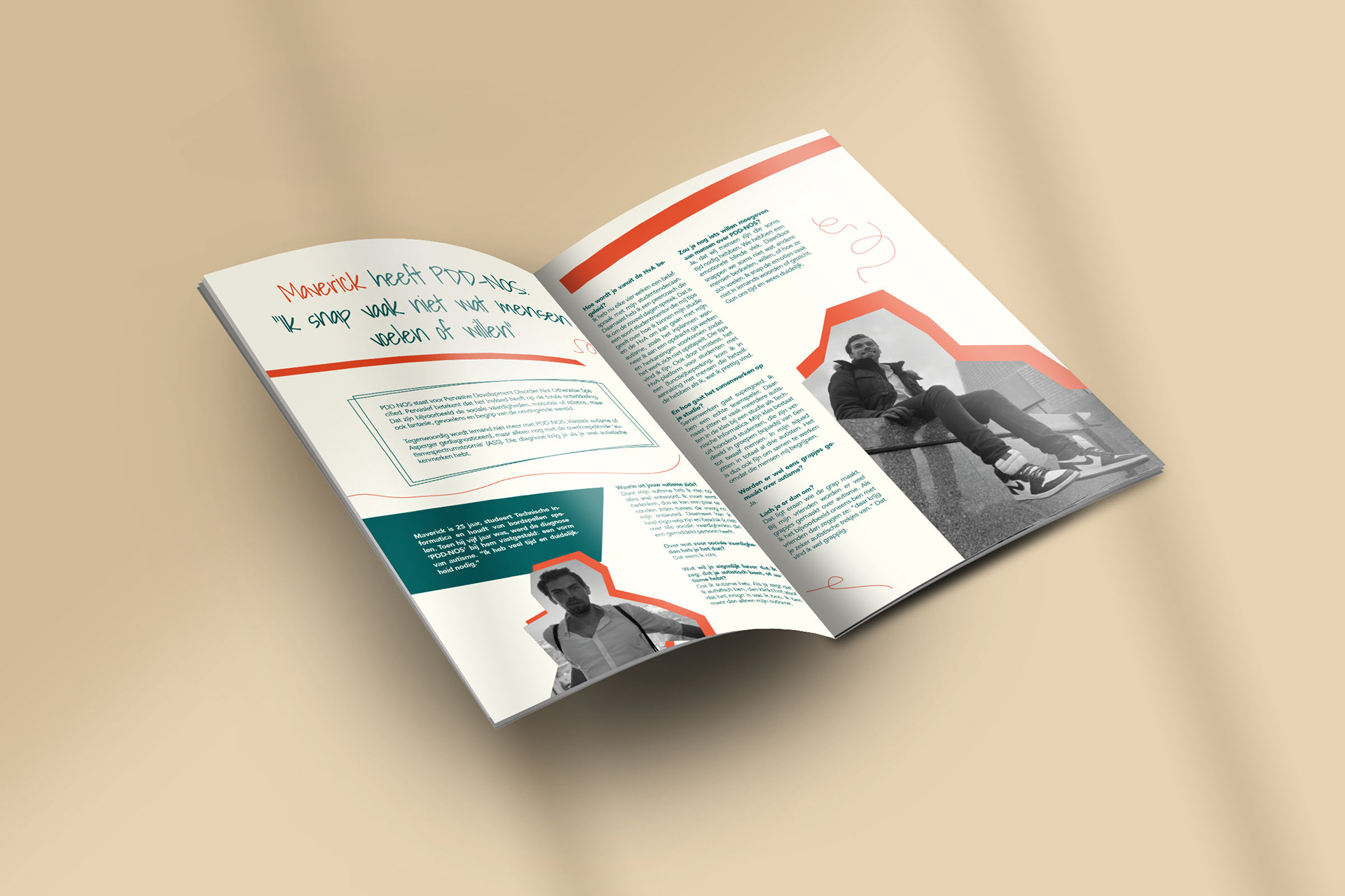
Different is an online magazine about students and employees with a mental and/or physical disability, including people with an hearing impairment, visual impairment, ADD (Attention Deficit Disorder), and someone with a leg prosthesis. Throughout the magazine we aim to give the interviewees the attention they deserve. My assignment was to design the magazine.
Are you interested about how I designed this magazine? Scroll down further on this page!
You will also find a link to the online magazine.
Are you interested about how I designed this magazine? Scroll down further on this page!
You will also find a link to the online magazine.
Date: May, 2021
Software: Adobe Illustrator, Adobe InDesign, FlipSnack
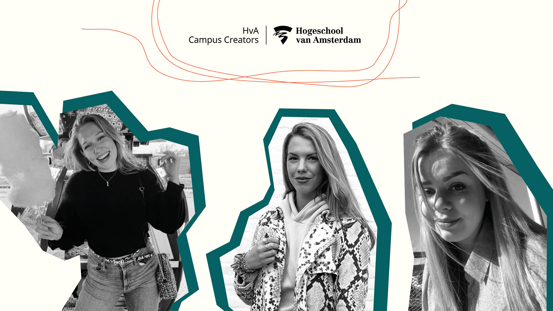
Commissioned for: HvA Campus Creators Publishing
Software: Adobe Illustrator, Adobe InDesign, FlipSnack
Commissioned for: HvA Campus Creators Publishing
Design choices
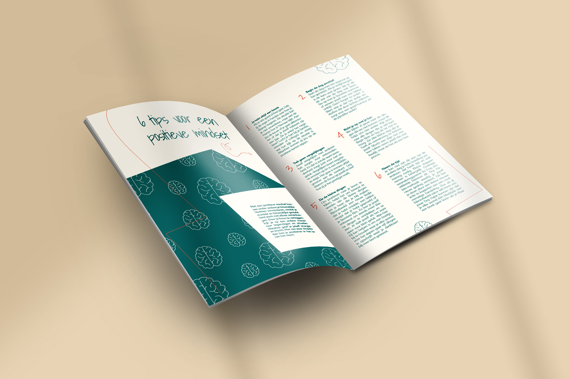
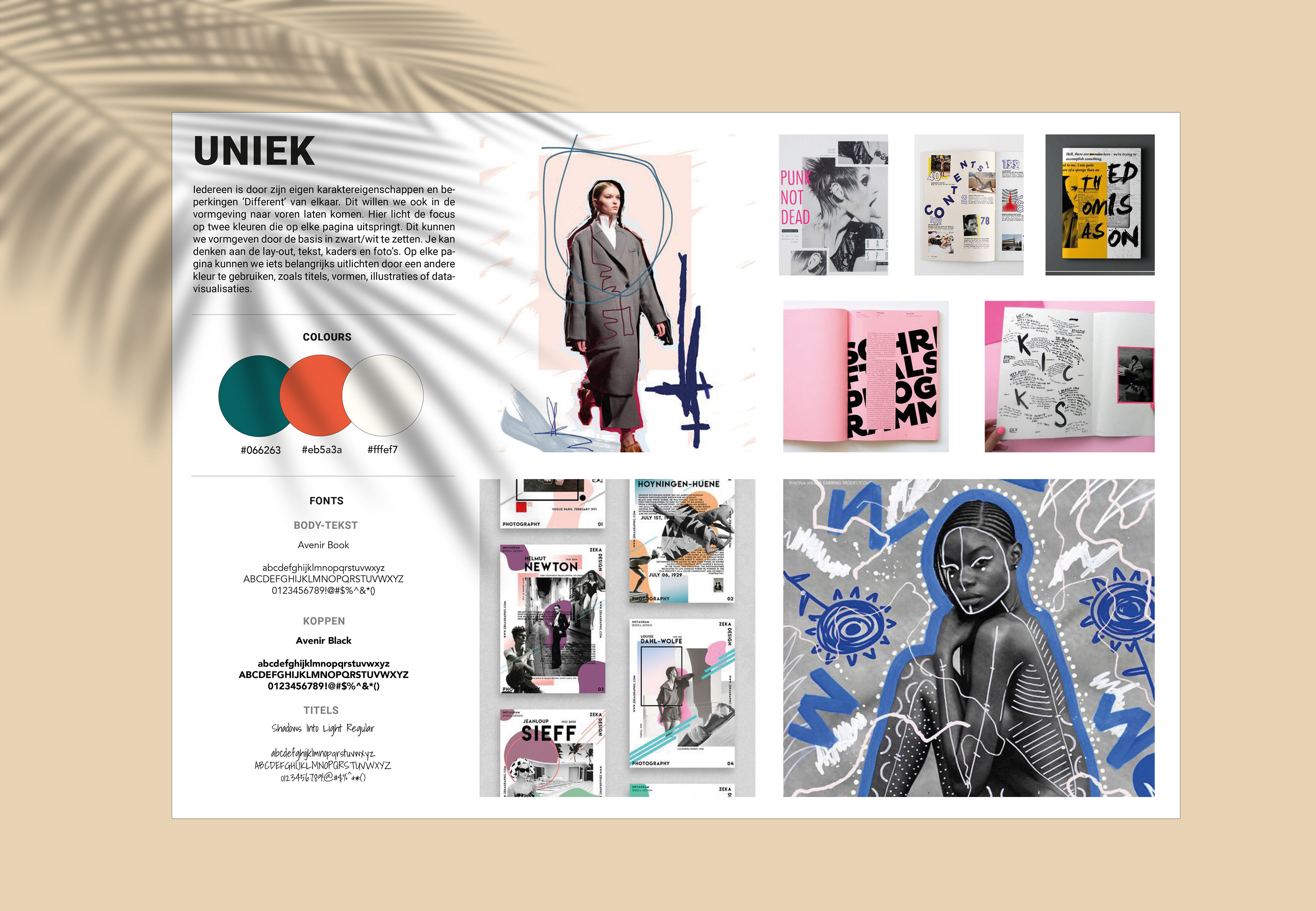
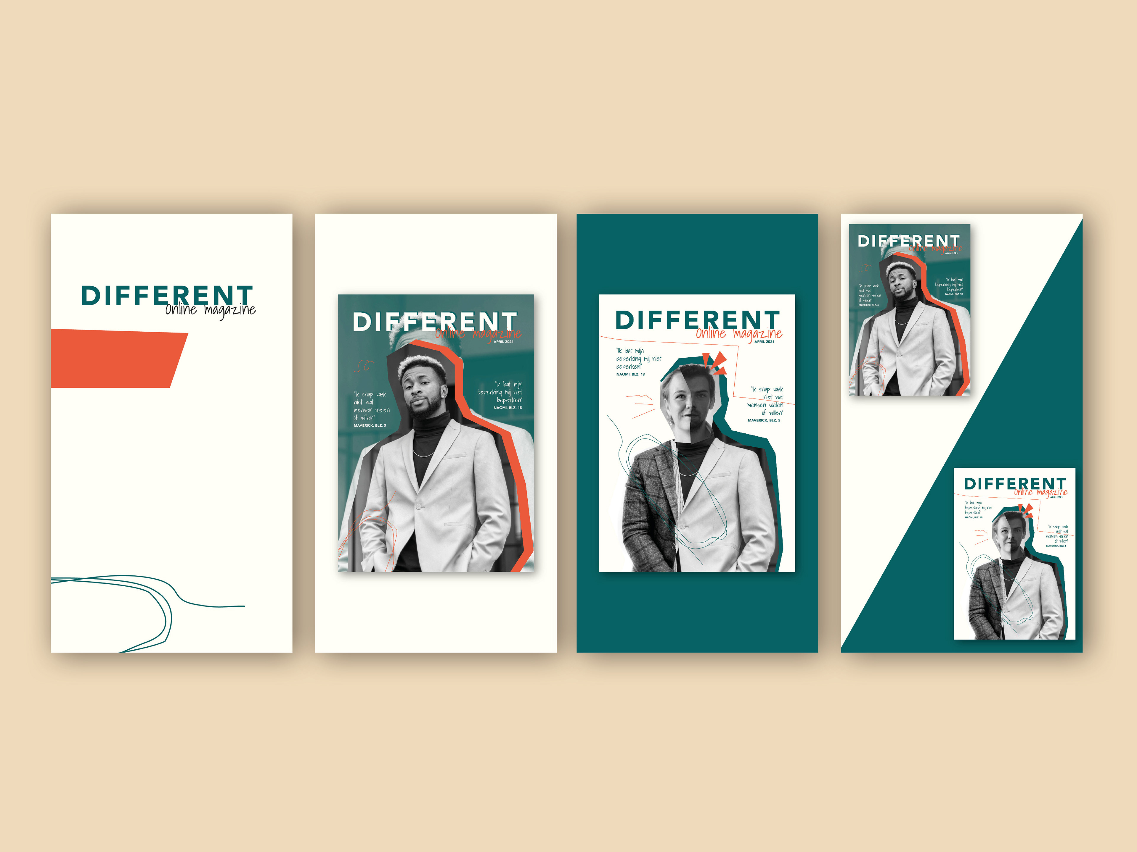
The magazine is called 'Different', which is why I chose to design each page differently, therefore, every page is unique.
I chose the colors green and orange as color palette. The green color represents peace, health and reliability. I chose the orange color because it is complementary to green, which in turn provides contrast. The white/beige color matches the green and orange colors and ensures that it is less bright on the screen. This is better for your eyes and makes the magazine more pleasant to read. In the online magazine you see a lot of twists and crazy shapes, I chose this because I also want to send a message: not everything and everyone has to be perfect. For magazine consistency, I use the same fonts and colors on every page. The photos have been edited to greyscale to create some peace and consistency to the pages.
I chose the colors green and orange as color palette. The green color represents peace, health and reliability. I chose the orange color because it is complementary to green, which in turn provides contrast. The white/beige color matches the green and orange colors and ensures that it is less bright on the screen. This is better for your eyes and makes the magazine more pleasant to read. In the online magazine you see a lot of twists and crazy shapes, I chose this because I also want to send a message: not everything and everyone has to be perfect. For magazine consistency, I use the same fonts and colors on every page. The photos have been edited to greyscale to create some peace and consistency to the pages.
Promotions
We were able to draw more attention to the magazine, by getting the opportunity to promote our work at a number of companies, in, for example, newsletters or on social media. Below you can see, for instance, a press release in the HvA Limitless newsletter.
Vote vote vote!
I made several designs for the magazine cover. The Campus Creators Publishing editorial staff was unable to decide which one should become the cover design. That is why we chose to let the followers vote for the most appealing design on the Campus Creators Instagram, for which I designed an Instagram story to allow the followers to vote. Can you see which cover it turned out to be?